
Giving an established brand new energy.
GATEWAY HILLS ATHLETIC CLUB
Brand Refresh · Digital · Marketing
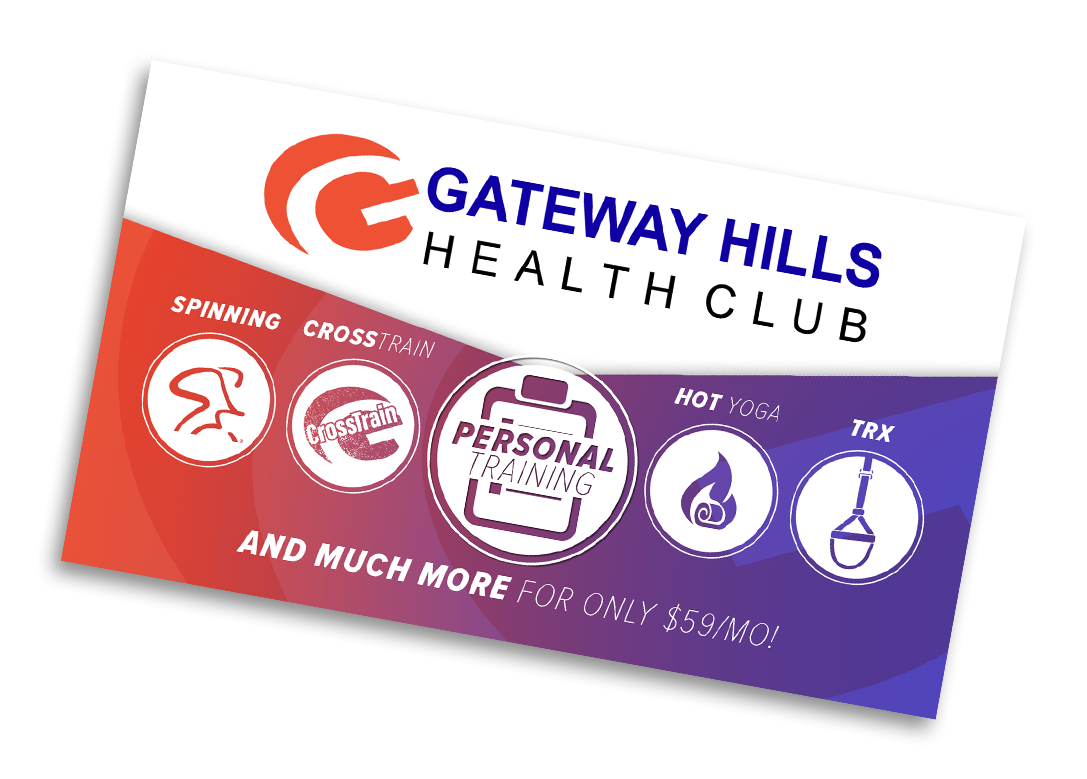
Gateway Hills Athletic Club needed a refreshed identity that could feel consistent across everything from its digital presence to marketing materials, fitness programs, and new sub-brands.
The Challenge
Gateway Hills Athletic Club already had an established logo and identity, but the brand needed new energy. The challenge was to build on what was already recognizable—rather than replace it—and develop a fresh visual direction that could feel consistent across the club’s growing range of programs and marketing.
Through updated color, typography, imagery, and layout, the existing identity became the foundation for a more vibrant and flexible brand system spanning digital, social, print, and specialized offerings.
My Role
Brand Refresh · Art Direction · Graphic Design · Web Design
Building on the Brand
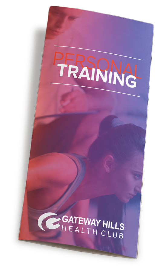
Rather than starting over, I focused on finding new ways to make the existing Gateway Hills identity feel more energetic, contemporary, and flexible. I expanded the visual language through bold color, dynamic photography, typography, and layout—giving the brand a recognizable look that could adapt across very different applications.
That system became the foundation for everything from the website and social media to personal training materials, promotional campaigns, business collateral, and new offerings within the club.
A Brand in Motion
The refreshed visual system came to life across every touchpoint—from digital experiences and social media to print collateral, promotional campaigns, and specialized programs.

The Outcome
The refresh gave Gateway Hills a more energetic and cohesive visual presence without abandoning the identity its members already knew. The expanded brand system created a flexible foundation that could support everything from everyday marketing to new programs and experiences—while still feeling unmistakably Gateway Hills.